
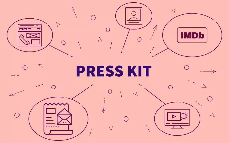
A press kit is the single link you send when somebody needs your material and you do not want to send five attachments.
Every design now takes two colors from you: an accent and a background. They flow through links, buttons, headings, your email signature and your business card.
Plenty of actors have analytics on their website and no idea whether it works. The tag is there, the page loads, and the reports stay empty.
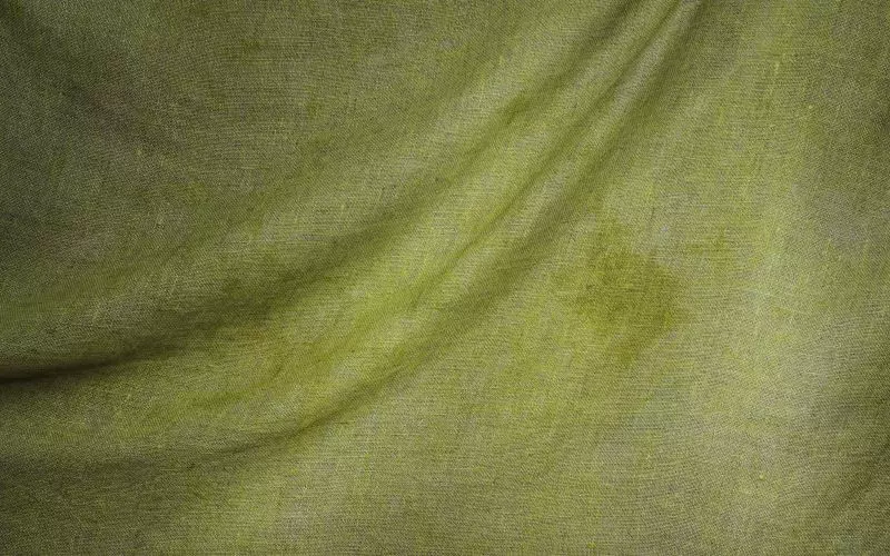
You can now set a background texture on any template: paper, linen, concrete, fine grain, and a handful of others. It sits behind your content and changes nothing about the layout.
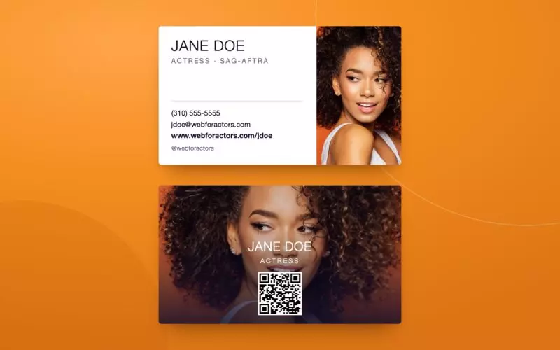
The Business Card Maker builds card art from what is already in your account. Your name, your site address, and your social handles come across without you retyping any of it.
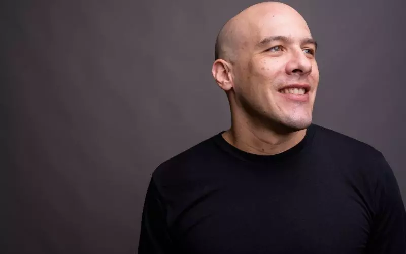
Every design now has a grayscale switch. On, and the whole site renders in black and white: photographs, accents, everything.

On a finished resume, education and training sit next to each other and look like variations of one idea. You went somewhere, you studied something, there are dates.

Coming soon is now a setting rather than a mode you get stuck in. Choose the design, write the text, switch it on, and switch it off when you are ready.
An address on your own domain is the cheapest thing you can do that makes you look like you have been working longer than you have.

Two new coming soon designs are available. They are what your domain shows while the real site is being put together.

A working actor accumulates media faster than they expect. Two rounds of headshots, production stills from four jobs, a reel, three clips cut from the reel, behind-the-scenes photographs somebody sent you.

Voicebox has been rebuilt. It looks essentially the same and it weighs about a fifth of what it did. If you use it, you do not need to do anything.